Eco-design and inclusion study
Discover
Helping customers feel confident in their financial decisions through clear and intuitive client spaces.
Design and delivery of several white-label life insurance client spaces: a unified UX shared across brands, then declined into brand-specific UIs, each adapted to its identity.
6 months
1 designer
UX/UI Design, Design Thinking, UX Research
Competitive analysis and sharing of best practices
Preparation and facilitation of workshops with business and technical teams
Design of wireframes and interactive mockups (desktop and mobile)
Organization and analysis of user testing sessions
Life insurance is a complex field that mixes legal jargon, financial stakes and high emotional load. Customer journeys in this sector often tend to be confusing and anxiety-inducing, while clients mainly expect to feel guided and reassured.
Problematic : How to design white-label client spaces with a unified UX across brands, while delivering UIs that reflect each brand’s identity?
I don’t know much about life insurance… When I log in to my client space, I need to be guided and reassured. Since the decisions I make involve my money, I want to be sure I’m not making a mistake.
Client
The project was structured into severals design sprints of 1 to 2 months, with a recurring 4-step cycle:
Inspiration examples were renewed at each sprint depending on the topic, while personas remained the same to ensure consistency across the project.
Each screen was delivered in two final versions, one per brand, but always based on a shared UX foundation.
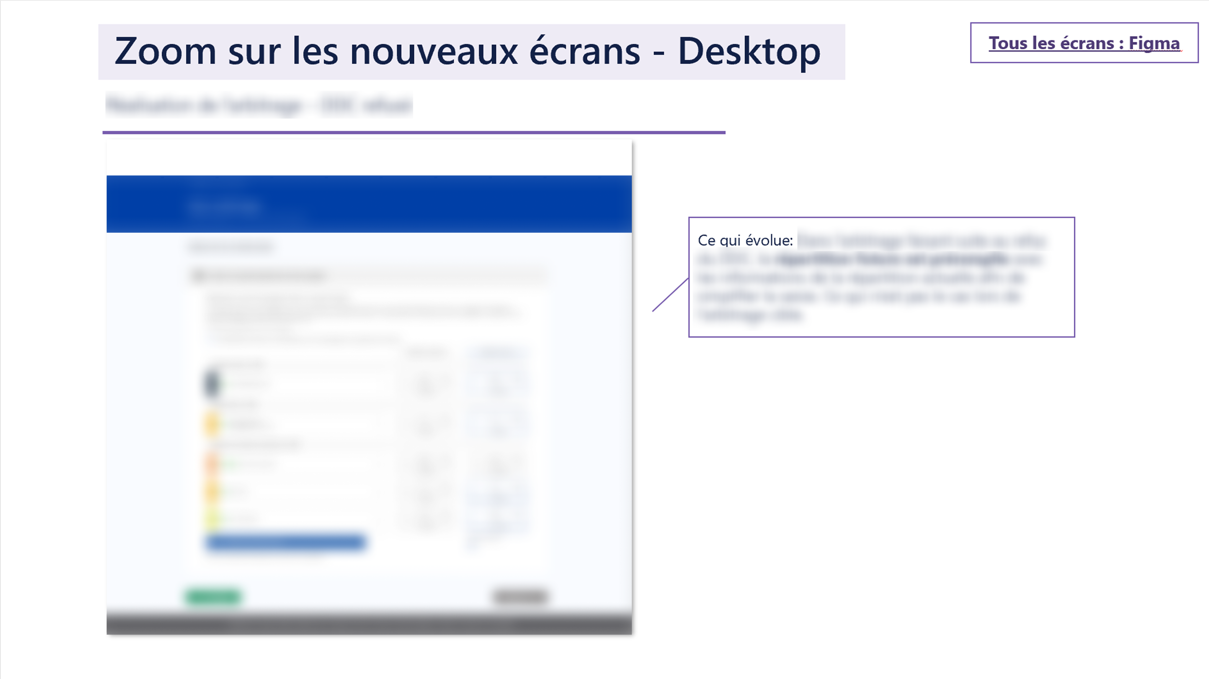
To preserve client confidentiality, the interfaces shown here have been altered and all identifying details blurred.
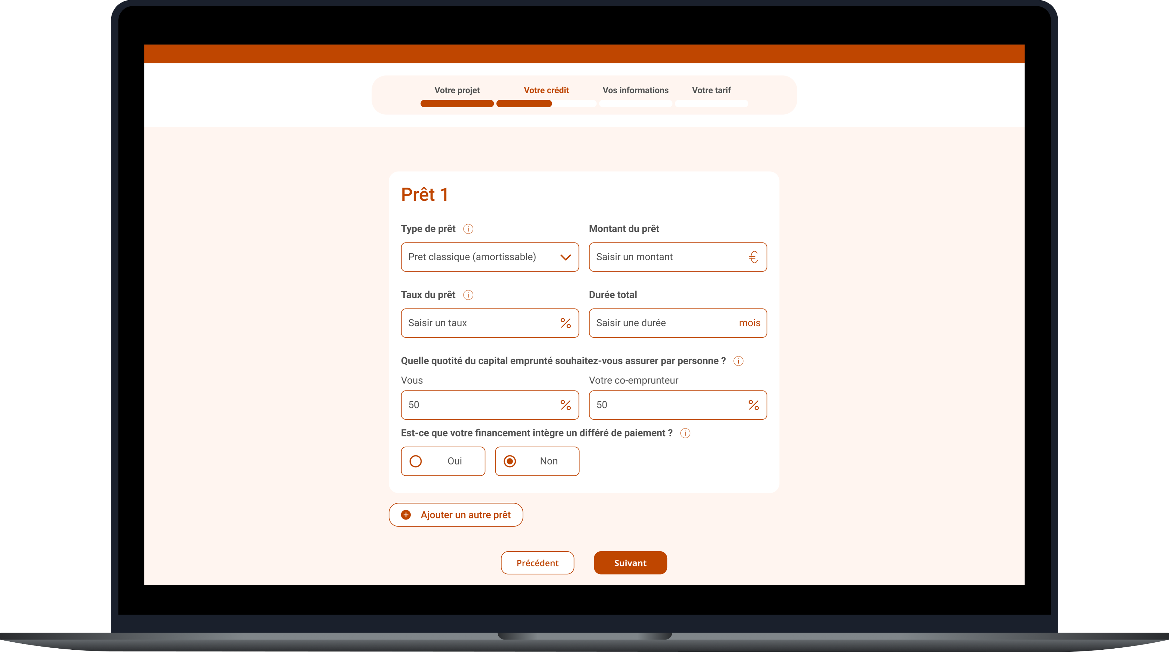
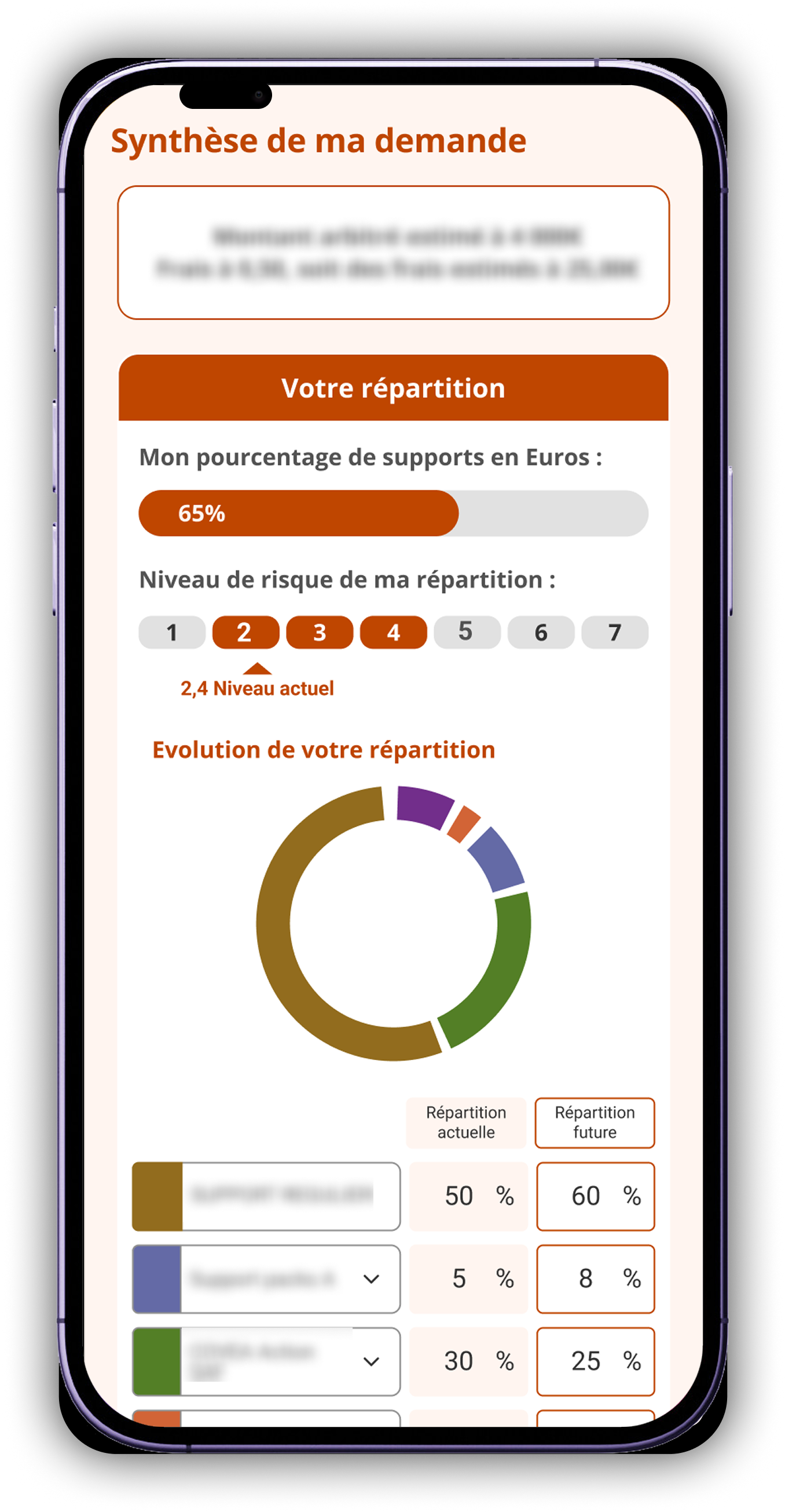
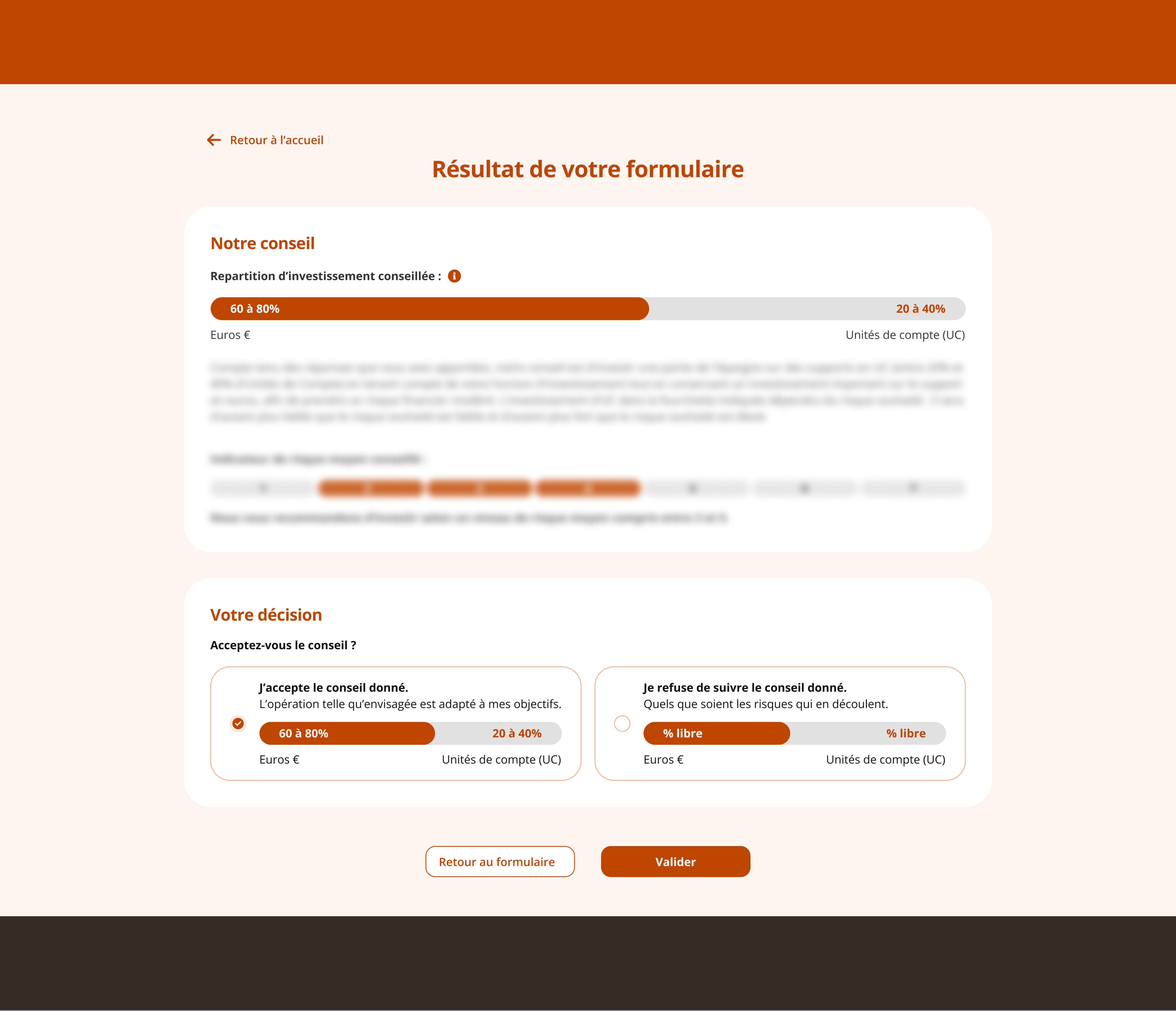
One of the main challenges was designing for two products with different technical and business constraints, while ensuring a unified and consistent user experience.
Designer’s note
Here are the lessons I carry forward into future projects.
Rapidly learning the specificities of life insurance enabled me to design accurate and relevant journeys despite the technical complexity.
Defining a unified UX while creating brand-specific UIs was both a methodological and organizational challenge.
Coordinating with many stakeholders taught me to align my work with sprints and adapt to varied team rhythms.
Discover

Helping customers feel confident in their financial decisions through clear and intuitive client spaces.
Design and delivery of several white-label life insurance client spaces: a unified UX shared across brands, then declined into brand-specific UIs, each adapted to its identity.
6 months
1 designer
UX/UI Design, Design Thinking, UX Research
Competitive analysis and sharing of best practices
Preparation and facilitation of workshops with business and technical teams
Design of wireframes and interactive mockups (desktop and mobile)
Organization and analysis of user testing sessions
Life insurance is a complex field that mixes legal jargon, financial stakes and high emotional load. Customer journeys in this sector often tend to be confusing and anxiety-inducing, while clients mainly expect to feel guided and reassured.
Problematic : How to design white-label client spaces with a unified UX across brands, while delivering UIs that reflect each brand’s identity?
I don’t know much about life insurance… When I log in to my client space, I need to be guided and reassured. Since the decisions I make involve my money, I want to be sure I’m not making a mistake.
Client
The project was structured into severals design sprints of 1 to 2 months, with a recurring 4-step cycle:
Inspiration examples were renewed at each sprint depending on the topic, while personas remained the same to ensure consistency across the project.
Each screen was delivered in two final versions, one per brand, but always based on a shared UX foundation.

To preserve client confidentiality, the interfaces shown here have been altered and all identifying details blurred.


One of the main challenges was designing for two products with different technical and business constraints, while ensuring a unified and consistent user experience.
Designer’s note
Here are the lessons I carry forward into future projects.
Rapidly learning the specificities of life insurance enabled me to design accurate and relevant journeys despite the technical complexity.
Defining a unified UX while creating brand-specific UIs was both a methodological and organizational challenge.
Coordinating with many stakeholders taught me to align my work with sprints and adapt to varied team rhythms.
Discover

Helping customers feel confident in their financial decisions through clear and intuitive client spaces.
Design and delivery of several white-label life insurance client spaces: a unified UX shared across brands, then declined into brand-specific UIs, each adapted to its identity.
6 months
1 designer
UX/UI Design, Design Thinking, UX Research
Competitive analysis and sharing of best practices
Preparation and facilitation of workshops with business and technical teams
Design of wireframes and interactive mockups (desktop and mobile)
Organization and analysis of user testing sessions
Life insurance is a complex field that mixes legal jargon, financial stakes and high emotional load. Customer journeys in this sector often tend to be confusing and anxiety-inducing, while clients mainly expect to feel guided and reassured.
Problematic : How to design white-label client spaces with a unified UX across brands, while delivering UIs that reflect each brand’s identity?
I don’t know much about life insurance… When I log in to my client space, I need to be guided and reassured. Since the decisions I make involve my money, I want to be sure I’m not making a mistake.
Client
The project was structured into severals design sprints of 1 to 2 months, with a recurring 4-step cycle:
Inspiration examples were renewed at each sprint depending on the topic, while personas remained the same to ensure consistency across the project.
Each screen was delivered in two final versions, one per brand, but always based on a shared UX foundation.

To preserve client confidentiality, the interfaces shown here have been altered and all identifying details blurred.


One of the main challenges was designing for two products with different technical and business constraints, while ensuring a unified and consistent user experience.
Designer’s note
Here are the lessons I carry forward into future projects.
Rapidly learning the specificities of life insurance enabled me to design accurate and relevant journeys despite the technical complexity.
Defining a unified UX while creating brand-specific UIs was both a methodological and organizational challenge.
Coordinating with many stakeholders taught me to align my work with sprints and adapt to varied team rhythms.
Discover
